
MatPlotlib Library
Matplotlib is an open-source Python library used for creating static, interactive, and animated visualizations. It provides a wide range of plotting options to create 2D and 3D plots, histograms, bar charts, scatter plots, line plots, and more. Matplotlib is widely used in data visualization, scientific research, and data analysis tasks.
The core functionality of Matplotlib is provided by the `pyplot` module, which is inspired by MATLAB’s plotting interface. It allows you to create and customize plots with simple commands. Additionally, Matplotlib provides an object-oriented API that gives you more control over the figure and axes properties.
Let’s see a some examples of how to use Matplotlib to create static, animated, and interactive visualizations in Python.
					import matplotlib.pyplot as plt

# Sample data
x = [1, 2, 3, 4, 5]
y = [2, 4, 6, 8, 10]

# Create a line plot
plt.plot(x, y)

# Customize the plot
plt.title('Simple Line Plot')
plt.xlabel('X-axis')
plt.ylabel('Y-axis')

# Show the plot
plt.show()
When you run this script, it will display a simple line plot with five points connected by a line.

In this example, we imported Matplotlib as `plt`, created two lists `x` and `y` as sample data, and used the `plt.plot()` function to create a line plot. Then, we customized the plot by adding a title and labels to the axes using `plt.title()`, `plt.xlabel()`, and `plt.ylabel()` functions. Finally, we displayed the plot using `plt.show()`
Example 2
					import matplotlib.pyplot as plt

# Sample data
x = [1, 2, 3, 4, 5]
y = [5, 7, 2, 8, 6]

# Line plot
plt.figure(figsize=(8, 5))  # Set the figure size (optional)
plt.plot(x, y, marker='o', linestyle='-', color='b', label='Data Points')
plt.xlabel('X-axis')
plt.ylabel('Y-axis')
plt.title('Line Plot Example')
plt.legend()
plt.grid(True)
plt.show()

# Bar plot
plt.figure(figsize=(8, 5))  # Set the figure size (optional)
plt.bar(x, y, color='g', alpha=0.7, label='Data Points')
plt.xlabel('X-axis')
plt.ylabel('Y-axis')
plt.title('Bar Plot Example')
plt.legend()
plt.grid(True)
plt.show()

# Scatter plot
plt.figure(figsize=(8, 5))  # Set the figure size (optional)
plt.scatter(x, y, marker='o', color='r', label='Data Points')
plt.xlabel('X-axis')
plt.ylabel('Y-axis')
plt.title('Scatter Plot Example')
plt.legend()
plt.grid(True)
plt.show()
When you run this script, it will display three separate plots – a line plot, a bar plot, and a scatter plot – one after another.
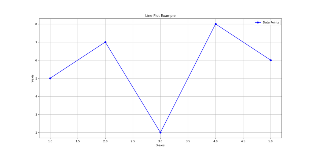
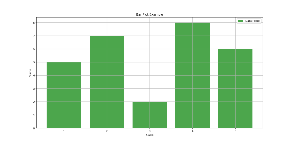
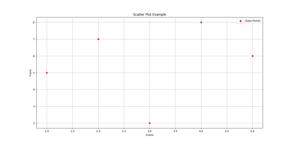
In this example, we imported Matplotlib as plt, created some sample data x and y, and used Matplotlib’s plotting functions to generate line, bar, and scatter plots. We set labels for the x-axis and y-axis, a title for each plot, and added a legend, grid, and custom colors. The plt.show() function is used to display the plot.
Example 3
					import matplotlib.pyplot as plt

# Sample data for plotting
categories = ['Category A', 'Category B', 'Category C']
values = [25, 40, 30]

# Create a bar plot
plt.bar(categories, values, color='c')

# Add labels and title
plt.xlabel('Categories')
plt.ylabel('Values')
plt.title('Bar Plot Example')

# Show the plot
plt.show()
This code will display a bar plot with the given data:
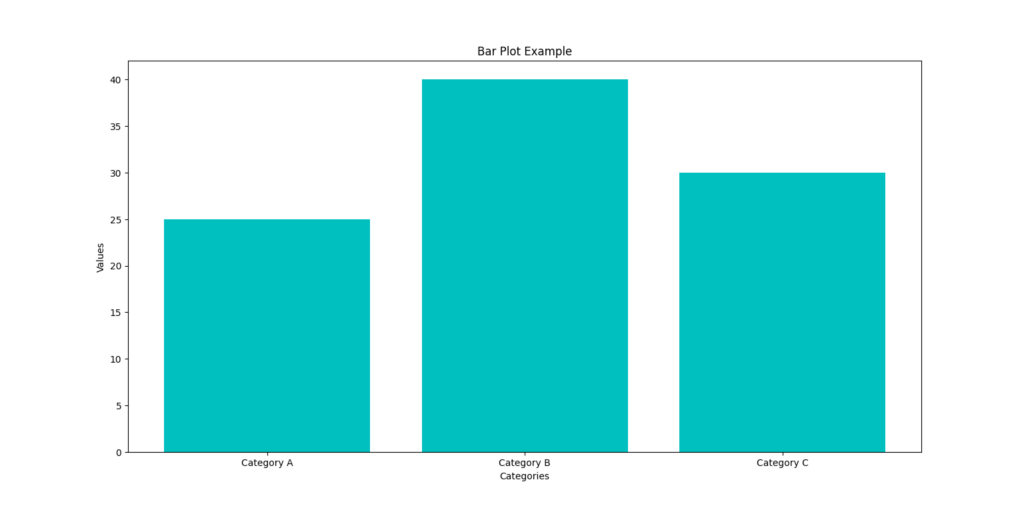
When you run this code, it will generate a bar plot with three bars representing the values of three categories: ‘Category A’, ‘Category B’, and ‘Category C’. Each bar will have a corresponding height representing its value. The plot will have labels for the x-axis, y-axis, and a title at the top.
Example 4
					import matplotlib.pyplot as plt
import numpy as np

# Generate random data
np.random.seed(42)
x = np.random.rand(50)
y = np.random.rand(50)

# Create a scatter plot
plt.scatter(x, y, c='blue', marker='o')

# Add labels and a title
plt.xlabel('X-axis')
plt.ylabel('Y-axis')
plt.title('Scatter Plot')

# Show the plot
plt.show()
When you run this script, it will display a scatter plot with randomly generated points.
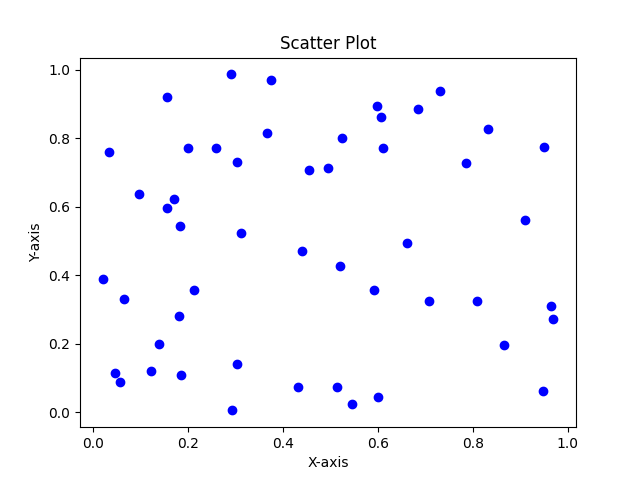
The resulting scatter plot will show 50 random points scattered in the plot, forming a pattern based on the random data generated for x and y. The plot will have labeled axes and a title, making it easy to interpret and understand the data.
Example 5
					import matplotlib.pyplot as plt
import numpy as np

# Sample data (randomly generated)
data = np.random.normal(0, 1, 1000)

# Create a histogram
plt.hist(data, bins=20, density=True, alpha=0.7, color='r')

# Add labels and title
plt.xlabel('Value')
plt.ylabel('Frequency')
plt.title('Histogram with Density Plot')

# Display the plot
plt.show()
When you run this script, it will display a histogram to visualize the distribution of this data.
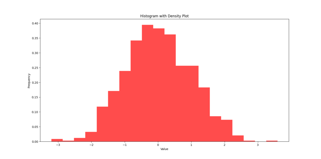
Overall, the code creates a histogram with 20 bins to show the distribution of randomly generated data from a standard normal distribution. The histogram is normalized to form a probability density plot, which is why the area under the histogram sums up to 1. The transparency of the bars is set to make the plot visually appealing.
To explore more libraries, you can refer our other blogs on Python Libraries